
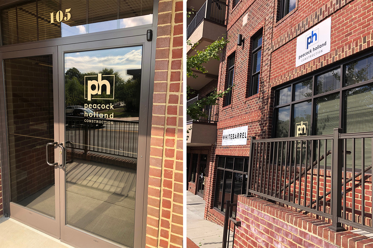
Peacock Holland Construction, a new Blacksburg based construction business specializing as a general contractor for multi-family and light commercial projects primarily the New River Valley area, needed a logo and marketing collateral pieces as they began.
We discussed their brand and mission statement, as well as what sets them apart. The co-owners wanted their branding to reflect their values of integrity, quality, and conviction. They wanted a professional look and specifically wanted a logo that incorporated their initials.
I set to work designing several logo concepts for them to choose from. The concept they selected blends their lower case initials in a more rounded font for a modern look. This is contrasted by the “frame” around their initials that reflects the clean lines that are found on a building site, conveying stability and trust. The word “construction” appears in all caps in a contrasting serif font, also conveying strength and stability. Their brand color palette is a combination of professional blues paired with natural sand and stone tones of the construction industry.
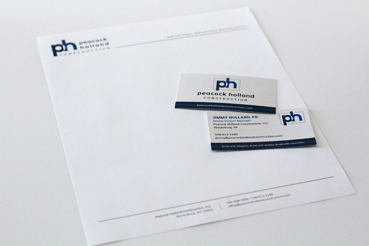
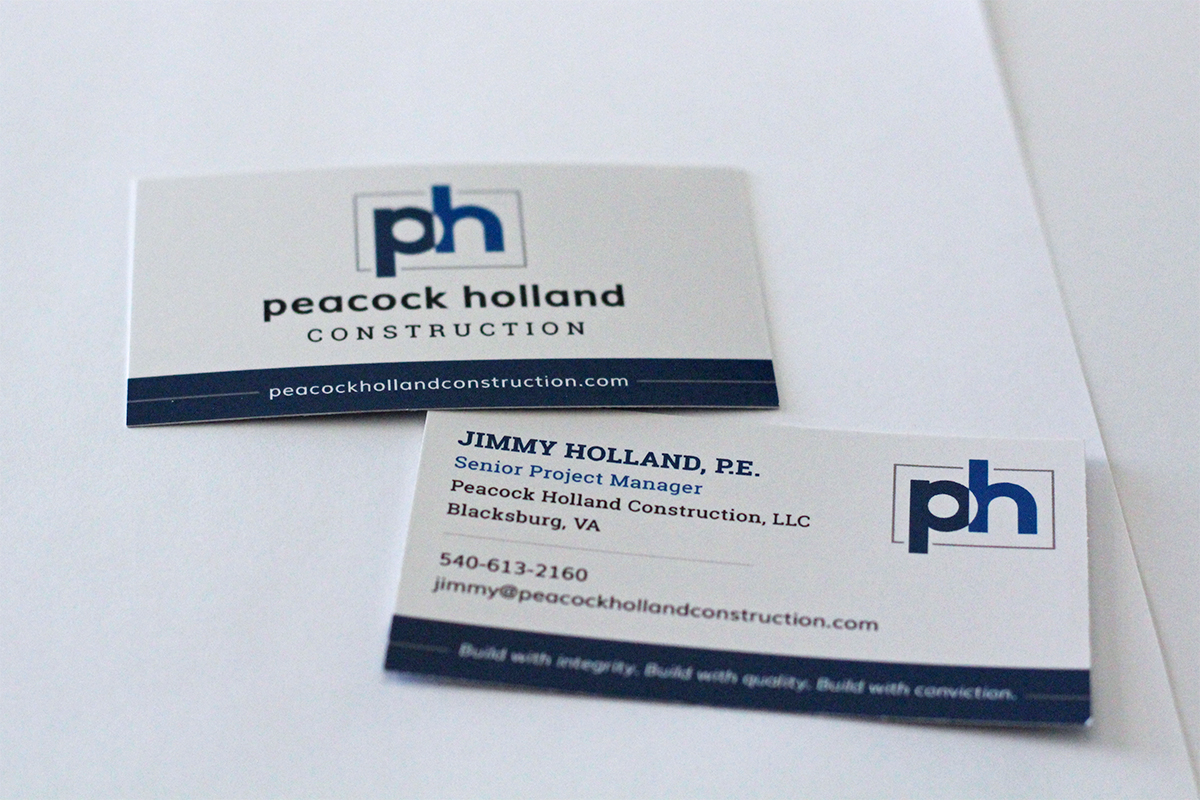
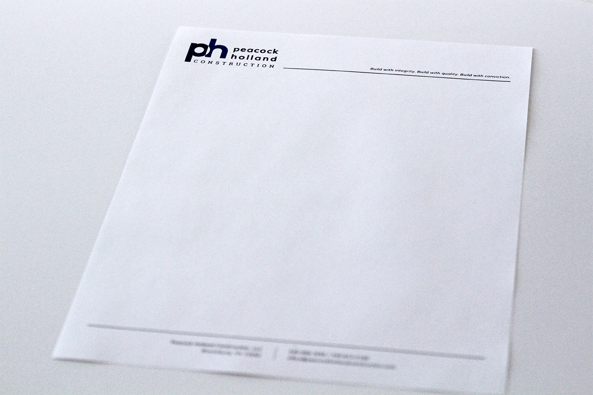
After finalizing the primary and alternate logos, I began on the business cards and letterhead design. The co-owners selected a minimalistic look for their letterhead and a two-sided business card featuring their logos and business mission statement.
Finally, I put together a social media image set including profile and cover photos for their company Facebook, LinkedIn, and Google Business pages.
Client
Peacock Holland Construction
Project Date
2018
